 |
Evolution of Style
|
I have been seeing lots of blues used in home decor recently. I never really liked bright sky blue, but there is just something so serene and clean and soothing about shades of blue-green. From turquoise to aqua, I am getting hooked. I am thinking about blue for my living room, and I am on a quest to find the perfect colors! Here are a sample of blue-greens I love.
 |
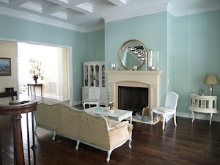
| Decor pad |
Palladian Blue by Benjamin Moore
Check out
Evolution of Style for more pictures of rooms painted with this beautiful color.
Wythe Blue by Benjamin Moore is one color down on the color strip from Palladian Blue. It is a little richer and deeper, therefore giving off a more definitive blue-green. Like Palladian, it has a gray cast to it, which enhances its ability to blend nicely in an environment with other color elements. It has been named the 2012 Color of Year by Benjamin Moore. I think this color has a retro vibe to it, reminding me of the blues used in home decor in the 1950s and 60s.
 |
| Avenue B Development |
 |
Avenue B Development
|
The pictures above are from
Avenue B Development, a construction & Design firm in Austin Texas. Go to their website and take a look at the amazing before and after pictures. Beautiful work.
is a popular color and although it is included in their green color section, it looks like a light aqua tinged with gray to me. Sherwin Williams has partnered with The Robert Allen Group to color-match paint to Robert Allen's fabric collections, and Rainwashed is coordinates with their
Hydrangea Collection. For those of you who are unfamiliar with Robert Allen Group, they provide the interior design trade with decorative fabrics for upholstery, multi-purpose and window fabrics, along with decorative trim and hardware.
Both of the pictures above are from the blog
Studio ten 25. Go there to view some nice pictures of her bedroom & bath painted with Rainwashed. Not only is the color great, but her decorating is inspiring.
So that's all the blue paint examples for now. What's next? Hmmm maybe orange!


 Wythe Blue by Benjamin Moore is one color down on the color strip from Palladian Blue. It is a little richer and deeper, therefore giving off a more definitive blue-green. Like Palladian, it has a gray cast to it, which enhances its ability to blend nicely in an environment with other color elements. It has been named the 2012 Color of Year by Benjamin Moore. I think this color has a retro vibe to it, reminding me of the blues used in home decor in the 1950s and 60s.


Another very nice, tranquil, blue-green color is Portage by C2 (Benjamin Moore)....looks great with coral colors if you are looking to pop a little punch of orange into your color scheme...it's a very pleasing, happy color....
ReplyDeleteThanks for the comment, Ellen. I just checked out the C2 collection. I love the neutrals. Portage reminds me of Wythe blue but with more gray, which makes it more neutral and more versatile. I agree with you, looks like it would work well with pops of orange.
ReplyDelete