Saturday, March 31, 2012

Collections used in home decorating

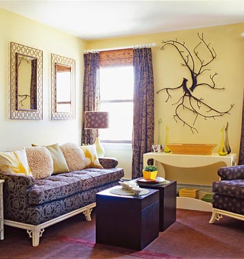
I have been noticing that a lot of bloggers are showing off their collections. They collect all sorts of stuff. I love seeing collections used in home decor because they add character and personality.
 It is so boring looking at page after page of cookie cutter rooms, all staged to perfection with the latest trends. I am drawn to rooms that have a touch of whimsy and reflect the interests and tastes of the owner (even if they are not on the 'trendy' list). In the past few days I have seen an egg cup collection from Claudia over at Mockingbird Hill Cottage that I love. They are so vintage and endearing. They fit perfectly with her cottage decor. I  have to admit, I have never seen an egg cup collection before, so I did a little research.There are plenty of items on sale on Ebay and Etsy. Here are a few examples of egg cups I found:


Betsy Speert has a great collection of Royal Copley ceramic birds which fill almost every room of her Florida cottage. They look great in her 1950s vintage tropical decor. Here are a few I found on Ebay:


Gayle of Vintage Farmhouse posted about her collection of floral artwork, mostly small original oil paintings. I love the way original art looks on a wall. It gives the room such a distinct personality. 


I have several collections. I have Blue & White Christmas plates, which are currently in storage because I can't find a wall they look good on. I also have a collection of teapots, but stopped collecting about 10 years ago because I don't have enough places to display them. (I became interested in teapots when I visited the Red Lion Inn in Stockbridge MA. They had shelves in every room, high up next to the ceiling and sitting on those shelves were all sorts of beautiful teapots. I was hooked.)
Right now I have a small collection of colored glass, sitting on window sills and hanging in windows. I love the way the light shines through them. Here are a few pictures I took this morning

That little rabbit is the newest member of my glass collection. Behind him are small antique bottles that used to hold bitters.


I think collections add character to a house, and with all the bloggers showing off their collections, I can see that I am not alone. How about you? Do you display a collection in your home?

Linking this post up to Chic on a Shoestring Decorating Linky Party!

Tuesday, March 27, 2012

I've got the Palladian Blues!

I finally narrowed my color choice for the living room. I chose SW Sea Salt, SW Rainwashed, BM Palladian Blue, BM Woodlawn blue. I went to the store and got a sample of Palladian Blue. This was my first choice. I painted a piece of art paper (specially treated for acrylic paint) and taped it on the wall. I moved it to different spots in the room and looked at it for several days in different light. The verdict? It looks completely different on the wall than it did on the chip and in all the pictures of rooms online that were painted Palladian Blue. How disappointing. On my walls it looks bright green/aqua....no hint of the beautiful blue I see in these pictures!! This illustrates the importance of buying a sample, painting a board and then looking at it on your walls in different lighting conditions. It is amazing how light effects the color!

BM Palladian Blue


http://www.caitlincreer.com/

Little Green Notebook

Aren't the pictures above beautiful? I love the subtle, soft blue/green. Now look at what Palladian Blue looks like in my room. Not so pretty. It looks like a bright seafoam. Its hard to find any blue! This picture was taken in the morning in natural light, no flash. At night, under artificial light it looks even greener.


So its back to the drawing board. I stopped by the Sherwin Williams store to pick up a few samples and was overcome with sticker shock. They were charging 6.99 for a quart. I asked if I could have a small sample. Nope. The quart is their sample size. Well, I was really not happy. Benjamin Moore sells sample jars and I only paid 2.88 ! I only used about a quarter of the jar to paint my paper that you see in the picture. There enough to paint a large board. Restoration Hardware sent me a good sized sample jar too, for 2.95 and free shipping.  About time Sherwin Williams gets on board and provides its customers with a real sample sized jar for a reasonable price! $7 for a sample jar? CMON!
Anyway, I am going to try a sample of BM Woodlawn Blue. It looks a little bluer than Palladian. I will post pictures later.

Tuesday, March 20, 2012

Blue & yellow living room inspiration!

     I have my color scheme for my living room narrowed down to pale blue/green, gray and yellow. I have been searching for pictures and have acquired quite a collection! I am sharing my favorite with you today, and if you arrived here by doing a goggle search for blue and yellow living rooms, I hope you will find some inspiration, too! After looking at all the different shades of aqua, blue, green, grays etc....my hubbie and I have chosen the following picture as the inspiration for our living room redesign. There are several things we love about it. Hubby loves the retro vibe achieved with the furniture and lamp. He immediately pointed out the radiator (he's an HVAC guy and is totally obsessed with heating systems and in love with radiators. I know, weird.). I love the very pale blue/green paint paired with the yellow drapes. The paint color has enough gray in it to look neutral and work with a variety of colors. I also love the chairs. We already have beautiful yellow drapes that have been sitting in a chest for a few years. I am looking forward to being able to use them again!


                                           Designer David Mitchell in Home and Design magazine

Here are some other blue & yellow living rooms that I  find inspirational.  The all exude the feeling I want in my new space!
Massucco Warner Miller Interior Design

I love the pale colors, it looks so calm and serene.


Home and Design

I love everything about this living room! This is actually part of the same room that is photographed in the first picture I posted. I didn't even realize it was the same room until I read  the story about it in Home and Design Mag and saw all the pics together! It is designed by David Mitchell.

Balancing Home


via Decor Pad
Borubudur.com

Canadian House and Home

So you can picture where I am heading with my living room decor. Pale aqua and yellow and gray,  a little bit of  a coastal influence, comfortable furniture and dark woods. I am heading to the paint store today with my chips, I will post a picture after I paint some boards.

Saturday, March 17, 2012

Everything Green ~ Happy St. Patrick's Day!


Since it is St. Patrick's day, I thought it would be fun to post everything green! Some bright, some outrageous, some subdued...all GREEN! Hope you have a wonderful day!


Sweet Life in the Valley

rue-muffetard.com


Vintage Junky

diggers list

Decor Pad

Cline Rose Designs


House Beautiful


                                                                           Elle Decor


via Alkemie

Shelterness.com

Friday, March 16, 2012

Chandeliers everywhere!

    I have always loved chandeliers. Oh, and this is one of my pet peeves: It's Chandelier not Chandy! This little slang term is like fingernails on a chalkboard for me! I don't know why it stirs up such emotion, maybe because it washes away the french origins of the word and somehow makes it less elegant. Anyway, its on the list of  "trends that bug me".
    Now back to the love of chandeliers. I grew up in a house full of them. My Mom loved them and filled her house with them. We didn't live in a big house, but we had two hanging in the living room, one in the kitchen, the dining room and  the foyer. Popularity of chandeliers has ridden the trend wave through the years, and right now seems to on top of the wave again! I am seeing them everywhere...not just the traditional living rooms and dining rooms, but in bedrooms, nurseries, children's rooms, bathrooms, closets and even outdoors on porches and  hanging from trees!
     There is a new trend emerging ~ two matching chandeliers over islands in kitchens. Do you like this look or do you think its just a little too much? I'm torn on this one. I like the chandeliers, but I think this may just scream "trendy".


via Obsit.com


via Living Livlier
Here are some nursery chandeliers~

lightsonline.com

Apartment Therapy


In bathrooms~
<>
Luxury -Idea.com


Would you put one in a closet?  room-galleries.myhomeideas.com

I think Chandeliers in bedrooms are romantic!


House Beautiful

New England Fine Living

I love love love outdoor chandeliers. They are soooo romantic!

http://www.undeniablestyle.comthings-i-need-more-of-in-my-life-front-porches-fireplaces/

Better Homes Team


Brilliant Event Planning
So are you a Chandelier person or a Chandy Gal? Do you have any in your house?


Thursday, March 15, 2012

Soft yellows from Benjamin Moore~ Hawthorne Yellow, Weston Flax, Concord Ivory!

Yellows can range from very pale to very bold and bright. I like to paint walls with buttery, creamy yellows  rather than the harsher, brighter ones. They provide a nice warm feeling in a room, yet are neutral enough to go well with a variety of other accent colors. Today I am going to show you some rooms painted in some soft Benjamin Moore yellows. These yellows are all from their Historical collection, which I find to be more muted and neutral than some of their other color collections. First up is a very popular Benjamin Moore color named Hawthorne Yellow. It can look rather bright in full sunlight, but it is a very pretty yellow.


Benjamin Moore Hawthorne Yellow

Potter Barn


via Restyling Home by Kelly


Another Benjamin Moore yellow  that is slightly lighter than Hawthorne Yellow HC4  is Weston Flax HC5:
Benjamin Moore Weston Flax HC12

via Decor Pad


via TheNest.com

via KellyRaeRoberts.com

One more shade of yellow from Benjamin Moore is Concord Ivory HC12. This is a deeper, warmer shade, which appears to have more tan in it. Notice how it looks in different light. Looks like a different color! That's why its important to always get a sample and paint a board, then look at it in different parts of your room and at different times of the day. You may be surprised at the variations in color.

Concord Ivory HC12

via Creative Elegance Interiors


Do you have a favorite yellow?                                                                                                                 Tell me the name of the paint and I might feature it on my next Paint Color post!