Wednesday, December 7, 2011

Painted Floors

Apartment Therapy
HGTV
                                                                                                                
  
Since we cannot afford to put hardwood floors down to replace out very ugly and outdated pink carpet, we are thinking about painting the living room sub-floor. My husband wants shiny black, but I am thinking of something lighter, I just don't know what color, since we I have not even chosen a color scheme for the room yet. I have been searching for pictures of floors that have been painted, and I have come up with quite a few. Looks like this is a popular trend. Who knew my current level of poverty would force me into "trendy" territory!  Actually, I prefer the look of painted floors over some hardwoods. They remind me of a cottage on the beach, which, by the way, is my favorite place to be. What do think? To paint or not to paint the floor...that is the question!
Martha Stewart 


Myhomeideas.com

  
Coastal Living


Tuesday, December 6, 2011

Tangerine & Turquoise, Peach & Aqua.... Orange & Blue !

Michelle Morgan Harrison


House to Home
A color combination that I would never had thought of before this year was the combination of orange and blue for home decorating. Those colors together used to make me sick...really. I would get a headache and nausea from being in a room with those colors together. My brain must be wired weird. So I avoided those colors for a long time. However, over the last year I have seen rooms with the orange-blue combination that I have actually liked! Now I am a fan. I no longer get sick at the sight of Turquoise & Tangerine. In fact, I am thinking about adding pops of these colors in my own home. My husband is also obsessed with orange. He keeps telling me he wants to paint the living room orange...hmmmm NO! But I will use orange as an accent for him. In my search around the web, I found lots of pictures and  even some sites totally devoted to these colors! Here are some pictures for you to enjoy and be inspired by.

Martha Stewart
HGTV  Judith Balis


Elle Decor


House to Home


Southern Living


Tobi Farley


Monday, December 5, 2011

Buntings...pennants, flags, triangles!


artfully arranged disarray
  I have noticed a decorating trend that is whimsical, easy to make yourself, inexpensive and  versatile...Buntings! Buntings are basically pennants strung together and hung up. I am seeing them everywhere, especially in nursery & children's rooms, though they are also used for garden parties, holiday decoration and as wall dressing in home decor. I especially like them because they can be easily color-matched and coordinated to your decor for minimal cost. They also can be easily replaced  as you change the look of your room. Buntings can be made with paper or  fabric. I am planning on making one for my daughter's room, as soon as I finished with the painting. I will post pictures...hopefully soon!


Rosenberryrooms.com
                                                    

Sunday, December 4, 2011

Thinking about aqua

Evolution of Style


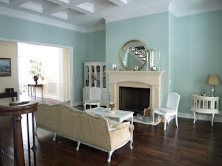
I have been seeing lots of blues used in home decor recently. I never really liked bright sky blue, but there is just something so serene and clean and soothing about shades of blue-green. From turquoise to aqua, I am getting hooked. I am thinking about blue for my living room, and I am on a quest to find the perfect colors! Here are a sample of  blue-greens I love.


Decor pad

Palladian Blue by Benjamin Moore

Check out Evolution of Style for more pictures of rooms painted with this beautiful color.


Wythe Blue by Benjamin Moore is one color down on the color strip from Palladian Blue. It is a little richer and deeper, therefore giving off a more definitive blue-green. Like Palladian, it has a gray cast to it, which enhances its ability to blend nicely in an environment with other color elements. It has been named the 2012 Color of Year by Benjamin Moore. I think this color has a retro vibe to it, reminding me of the blues used in home decor in the 1950s and 60s.


Avenue B Development
                Avenue B Development                  

     The pictures above are from Avenue B Development, a construction & Design firm in Austin Texas. Go to their website and take a look at the amazing before and after pictures. Beautiful work.

Less-than-Perfect Life of Bliss
 Rainwashed by Sherwin Williams is a popular color and although it is included in their green color section, it looks like a light aqua tinged with gray to me. Sherwin Williams has partnered with The Robert Allen Group to color-match paint to Robert Allen's fabric collections, and Rainwashed is coordinates with their Hydrangea Collection. For those of you who are unfamiliar with Robert Allen Group,  they provide the interior design trade with decorative fabrics for upholstery, multi-purpose and window fabrics, along with decorative trim and hardware.


                                                                                             Both of the pictures above are from the blog Studio ten 25. Go there to view some nice pictures of her bedroom & bath painted with Rainwashed. Not only is the color great, but her decorating is inspiring.

Wednesday, November 30, 2011

Gray & Yellow

I am really warming up to the idea of gray, especially when paired with yellow. I don't like glaringly bright yellows unless they are used sparingly for just a pop of color. What I really like are warm buttery yellows and light & airy pale yellows. As far as gray goes, I love the warmer shades, though I must admit, I have seen some blue gray shades that have been very pretty. I have been searching for examples of gray & yellow rooms and I am sharing these with you today.                                                                                           


Dwell Studio


alkemie.blogspot


Pottery Barn

Pottery Bran

colorindesign.net


Weat Elm, Benjamin Moore Chelsea Gray


West Elm, Benjamin Moore Shadow Gray


Decor Pad


Decor Pad


Martha Stewart


Living Etc.


Monday, November 21, 2011

More inspiration from a great designer


Another designer that I love is Elizabeth Martin. What is interesting is that I had copied about 4 pictures of rooms into my Dream House folder before finding out that the rooms were all designed by the same person! I came across an article on Elle Decor.com which featured the homes of Alli Wentworth & George Stephanopolous (2 of my favorite people). Look at these beautifully decorated rooms. Elizabeth is so talented. I love how she seamlessly groups old and new together for a fresh, yet timeless look.Go to ElizabethMartinDesign.com to see her work.

Something's Gotta Give & James Rabin

About 4 months ago I started looking for rooms I love. What first came to mind was the Hampton Beach house in the movie Something's Gotta Give. Turns out lots of other people fell in love with that house too and there is plenty of info and pictures out there. These photos are on the designer James Radin's website, though I have read that Beth Rubino was the set designer. So maybe they worked together, I don't know. Radin's portfolio is beautiful. Rooms filled with air and light and serenity. I especially love how he uses artwork for a pop of color. I think about the beach when I look at his designs, and that's my favorite place to be. Here are a few other rooms in his portfolio.