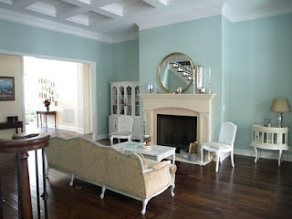
Showing posts with label Benjamin Moore Palladian Blue. Show all posts

Tuesday, March 27, 2012

I've got the Palladian Blues!

I finally narrowed my color choice for the living room. I chose SW Sea Salt, SW Rainwashed, BM Palladian Blue, BM Woodlawn blue. I went to the store and got a sample of Palladian Blue. This was my first choice. I painted a piece of art paper (specially treated for acrylic paint) and taped it on the wall. I moved it to different spots in the room and looked at it for several days in different light. The verdict? It looks completely different on the wall than it did on the chip and in all the pictures of rooms online that were painted Palladian Blue. How disappointing. On my walls it looks bright green/aqua....no hint of the beautiful blue I see in these pictures!! This illustrates the importance of buying a sample, painting a board and then looking at it on your walls in different lighting conditions. It is amazing how light effects the color!

BM Palladian Blue


http://www.caitlincreer.com/

Little Green Notebook

Aren't the pictures above beautiful? I love the subtle, soft blue/green. Now look at what Palladian Blue looks like in my room. Not so pretty. It looks like a bright seafoam. Its hard to find any blue! This picture was taken in the morning in natural light, no flash. At night, under artificial light it looks even greener.


So its back to the drawing board. I stopped by the Sherwin Williams store to pick up a few samples and was overcome with sticker shock. They were charging 6.99 for a quart. I asked if I could have a small sample. Nope. The quart is their sample size. Well, I was really not happy. Benjamin Moore sells sample jars and I only paid 2.88 ! I only used about a quarter of the jar to paint my paper that you see in the picture. There enough to paint a large board. Restoration Hardware sent me a good sized sample jar too, for 2.95 and free shipping.  About time Sherwin Williams gets on board and provides its customers with a real sample sized jar for a reasonable price! $7 for a sample jar? CMON!
Anyway, I am going to try a sample of BM Woodlawn Blue. It looks a little bluer than Palladian. I will post pictures later.

Thursday, January 26, 2012

Benamin Moore's Palladian Blue, Wythe Blue, Stratton Blue


Palladian Blue
Today I am going to look at the BM color strip that contains Palladian Blue HC-144, Wythe Blue HC- 143 & Stratton Blue HC-142! I have to admit these are 3 of my favorites. I like the soft blue/green with enough gray thrown in to make the colors act nicely as neutrals. Let's get right down to it and enjoy the rooms painted with these great colors!

Palladian Blue


Caitlin Creer Interiors


The Weekend Homemaker  


Jenny Komenda Interiors


http://www.flickr.com/photos/lynnannebruns/4755608524/sizes/m/in/photostream/


WYTHE BLUE is Benjamin Moore's color of the year for 2012! Here are a few rooms painted with this beautiful color.


Lakbdesign/Fergusandme


Avenue B Development


Benjamin Moore

Avenue B Development


Saturday, January 21, 2012

Living room inspiration and my design challenge!


My biggest goal this year is to redecorate my living room. This is a big job. My living room is unusual to say the least, and poses lots of design challenges. Today I will show you rooms that inspire me. I plan on taking elements from rooms I like, and incorporating them into my own unique design. What do you think? What elements would incorporate into my room? Pictures of MY room are are posted after the inspiration rooms.

Pawleys Island Posh The wall color is Tidewater by Sherwin Williams. The before & after for this room is amazing. Click on the link and visit the Pawleys Island Posh blog.

This room is from the set of one of my favorite shows Modern Family


I think most of you will recognize this great room by James Radin. It's from the movie Something's Gotta Give.


This room is painted Benjamin Moore's Palladian Blue. Designed by Caitlin Creer Interiors.

This room is painted Stratton Blue by BM It is on the same color strip as Palladian and Wythe. This design is by Viscusi Elson Interior Design. You should go take a look at their portfolio.
Two more James Radin Designs. I LOVE his work! 
Go visit his site and enjoy!

Martha Stewart
Addicted 2 Decorating


Now for my living room....


 I plan to rip up the rug and paint the floors, and I am considering painting the fireplace. I want to get rid of the taupe/red walls and ugly pink rug.  (Did I mention how much I hate that pink rug? ). I need to lighten the walls and bring in more light. It gets very dark in the afternoon. The fireplace is a nightmare. It juts out into the room like the bow of a boat! The room has lots of angles So...what would YOU do with this design challenge?


Sunday, December 4, 2011

Thinking about aqua

Evolution of Style


I have been seeing lots of blues used in home decor recently. I never really liked bright sky blue, but there is just something so serene and clean and soothing about shades of blue-green. From turquoise to aqua, I am getting hooked. I am thinking about blue for my living room, and I am on a quest to find the perfect colors! Here are a sample of  blue-greens I love.


Decor pad

Palladian Blue by Benjamin Moore

Check out Evolution of Style for more pictures of rooms painted with this beautiful color.


Wythe Blue by Benjamin Moore is one color down on the color strip from Palladian Blue. It is a little richer and deeper, therefore giving off a more definitive blue-green. Like Palladian, it has a gray cast to it, which enhances its ability to blend nicely in an environment with other color elements. It has been named the 2012 Color of Year by Benjamin Moore. I think this color has a retro vibe to it, reminding me of the blues used in home decor in the 1950s and 60s.


Avenue B Development
                Avenue B Development                  

     The pictures above are from Avenue B Development, a construction & Design firm in Austin Texas. Go to their website and take a look at the amazing before and after pictures. Beautiful work.

Less-than-Perfect Life of Bliss
 Rainwashed by Sherwin Williams is a popular color and although it is included in their green color section, it looks like a light aqua tinged with gray to me. Sherwin Williams has partnered with The Robert Allen Group to color-match paint to Robert Allen's fabric collections, and Rainwashed is coordinates with their Hydrangea Collection. For those of you who are unfamiliar with Robert Allen Group,  they provide the interior design trade with decorative fabrics for upholstery, multi-purpose and window fabrics, along with decorative trim and hardware.


                                                                                             Both of the pictures above are from the blog Studio ten 25. Go there to view some nice pictures of her bedroom & bath painted with Rainwashed. Not only is the color great, but her decorating is inspiring.